Here, we will introduce you to the general structure of collections, guide you through various menus and settings, and also delve into detail about how to open and edit collection pages.
Each element within the collection is a separate card that can be edited: every item you add to your collection can be opened, where you can input any information you need.
Multiple views you can switch between: your data won’t get stuck in one format. You’ll be able to view the same collection as a kanban board, cards, a calendar, or a table (coming soon) — whatever makes the information most useful.
Collections: Tour
Every full-page collection has similar menus and sets of options. Here’s a brief guide using the example of the board view.
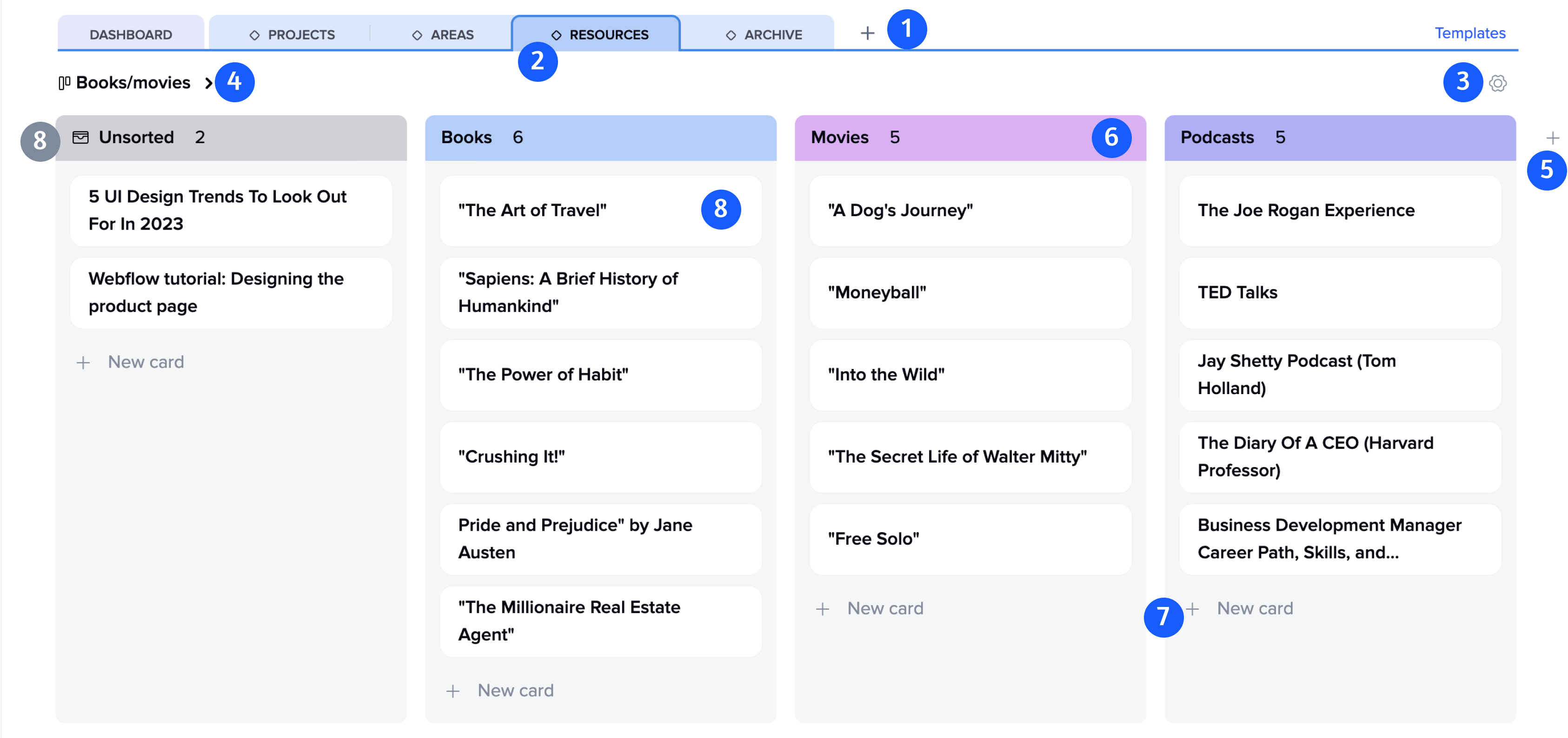
1. “Add New Page” button: Add a new page to your project, and choose between a regular page or a collection.
2. Collection icon: All collection pages have a distinctive icon.
3. Collection settings menu: This menu allows you to change the appearance of the collection and its name.
4. Creating and saving views: You can create various collection views with your own names and save them for quick toggling in the future.
5. “Add New Column” button: Add a new column to the board with a name of your choice.
6. Column Name and Color: You can change the column name and color anytime.
7. “New Card” button: Each column has a button to add new cards.
8. Default Column: This is where all unsorted blocks that you add from other project pages go. This column cannot be deleted, but you can change its name, color, and position.
Create a collection
A collection can be created in several ways:
First method: Create a new collection page in the project using the “+” button in the header.
Second method: Add blocks with creating a collection by specifying the collection name.
Populating the collection
Adding items to the collection: You can add both blocks and entire tiles to existing collections or create new ones right away.
Creating cards within the collection: You can create cards and detail them directly in the collection without leaving its boundaries.
Note: Items added to the collection from other pages are synchronized with each other, but if you delete a card from the collection, the source item will remain undeleted. However, if you delete the source item itself, the card in the collection will be automatically removed.
Collection views
Board View: This is the classic Kanban with columns.
Create columns with appropriate names and add cards to the corresponding columns.
You can change the color and order of columns, as well as move cards between columns.
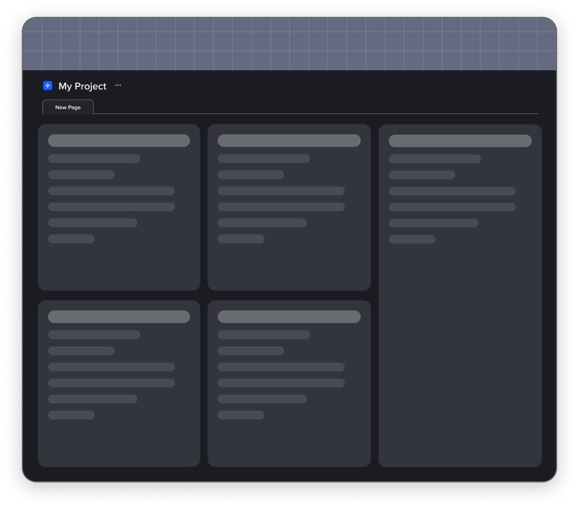
Card View: Blocks are presented as a gallery of individual cards with short descriptions and media files.
Cards have a fixed size and can be moved relative to each other. You can create cards directly in the collection or add blocks from any project page. To detail a card, simply open it.
Calendar View: Using calendar dates makes planning and tracking events, meetings, and other activities easier. Blocks in the collection that don’t have a set date will be displayed in a special “No Date” menu. You can easily place these blocks in the calendar by dragging them onto the appropriate dates.
Table View: Coming soon…
Join our community and stay tuned for product updates
Learn more about our plans and available features, visit the pricing page and choose the best option that fits your workflow.
Stay updated on xTiles product updates with the changelog.
Join the xTiles community on Slack and Discord instead visit the Youtube channel and xTiles blog, and follow us on social media to stay informed about the latest news, updates, and great content!