What happened to Walling
Walling built a loyal following among visual thinkers. It was a tile-based workspace that let you capture and arrange information spatially — closer to a pinboard than a document. For people who think in visuals rather than linear lists, it clicked immediately.
Then development slowed. Updates stopped arriving. The product went quiet. For users who had built their workflows around it, this was not just an inconvenience — it was a forced migration. When an app stops being maintained, you can keep using it until something breaks, or you can move before it does.
Kelly, a project manager and consultant who had been on Walling for some time, started looking for something that matched the same visual philosophy. He found xTiles — and has been using it for over a year. What surprised him was not that xTiles filled the visual gap, but that it went considerably further.
What visual thinkers actually needed from Walling
Walling's appeal was specific. It was not about features — it was about how information felt. Tiles you could see at once. Spatial arrangement that matched how your brain organized things. A way to display and capture information that did not force everything into a hierarchy of folders and sub-folders.
For someone like Kelly — curious, working across multiple projects at once, planning trips, managing consulting work alongside corporate engagements — the ability to spread information across a visual canvas was the feature. Everything else was secondary.
Walling users tend to be visual thinkers who find document-based tools like Notion too linear and structured. They want to see things spatially, not read them top to bottom.
If that describes you, xTiles is worth a close look. The tile-based layout is the foundation of the product, not an add-on — and it spans the full screen rather than being confined to a center column.
xTiles vs Walling: what is the same and what is different
The visual foundation is similar. Both products use a tile/card layout where you arrange content spatially. Both support projects and pages. Both are built for people who think visually rather than linearly.
The differences are where xTiles has grown beyond Walling's original scope:
- Active development — xTiles ships regular updates: a new mobile navigation, faster page switching, a rebuilt backend, an improved Web Clipper. Walling stopped iterating.
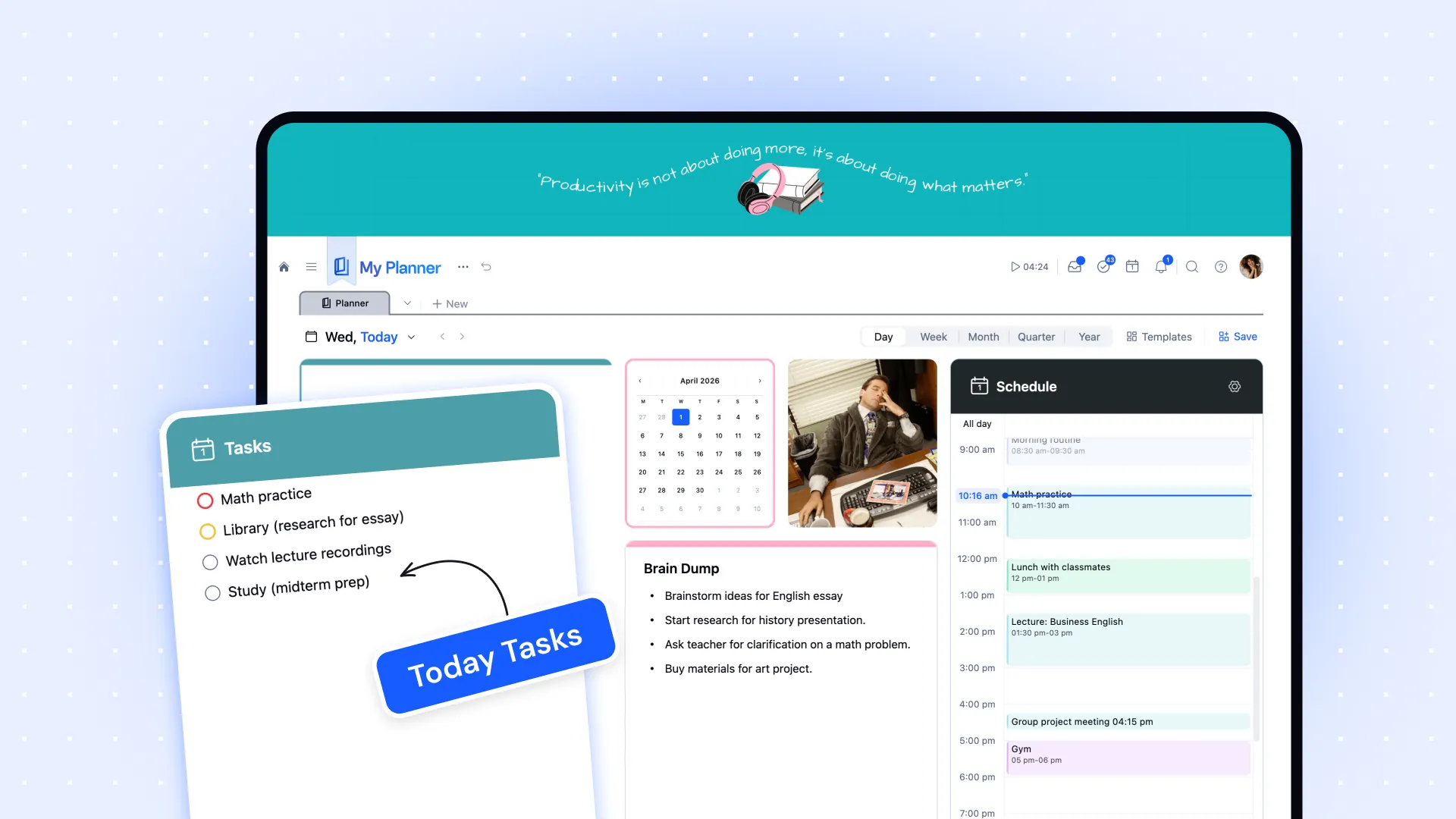
- Task management and planning — Walling had no meaningful task layer. xTiles has a full Planner that aggregates tasks across all projects into a dated weekly view. Kelly calls this "very powerful" and now uses it daily.
- Web Clipper with AI summaries — Walling's capture was basic. The xTiles Web Clipper saves content from any page with an AI-generated summary — not just a bookmark. Kelly started using this heavily: "Rather than just keep clipping bookmarks and links, to actually have some summaries and some text — that's super excellent."
- Claude AI integration — Walling had no AI layer. xTiles connects directly to Claude via MCP integration, enabling automated daily digests, newsletter summaries, and more — all landing as tiles in your Planner.
- Full-screen tile layout — xTiles uses the entire screen for your content, not a centered column. Visual thinkers who felt constrained by document-style apps tend to find this immediately satisfying.
The planning layer Walling never had
For Kelly, the biggest surprise in xTiles was the task and planning system. He came over as a visual capture user — projects, trip itineraries, reference pages. He expected the same.
What he found was that xTiles had become something he could use for day-to-day planning as well. The ability to convert any tile or text into a task, assign a date, and have it appear in the Planner changed how he used the tool. "Having it show up in the calendar, having the ability to create your custom week and day calendar — that's really powerful."
He had previously used a separate app for task management. Over time, xTiles replaced it — not because it forced him to change, but because the integration between his project pages and the Planner made everything easier to manage in one place.
Going further: AI-powered daily digest and voice notes
Kelly is also deep into AI — taking Anthropic courses, experimenting with Claude integrations, building custom skills. This is where xTiles became more than a Walling replacement.
His current daily workflow: Claude pulls his Gmail, Microsoft 365 calendar, newsletters, and voice note transcriptions — then creates a structured digest with one tile per item, landing in his Planner each morning. One of his more unusual setups uses a voice notes app with its own Claude MCP connector. Every day he records audio — meetings, ideas, brain dumps — and Claude transcribes, summarizes, and even reads his mood or emotional tone from the recordings.
"It's almost like a coach now. It's reading back my day based on my recordings — scarily accurate, but also kind of like a little friend giving you feedback."
None of this requires any coding. The xTiles + Claude integration is set up through natural language prompts converted into skills, with Claude itself helping to refine them. Kelly uses this to send project plans from Claude into xTiles and then sends xTiles project content back to Claude for analysis — a back-and-forth between planning and thinking.
Should Walling users switch to xTiles?
If you used Walling for visual capture and project display, xTiles will feel familiar within minutes. The tile layout, the spatial arrangement, the full-screen canvas — these are the same instincts, rebuilt in an actively maintained product.
The question is whether you want more. If you want to stay purely in visual capture mode, xTiles handles that cleanly. If you want tasks, day planning, AI integration, and a Web Clipper that actually understands what you save — xTiles has all of it, and it keeps getting better.
Kelly's summary: "Very similar to Walling, but also much more useful for day-to-day stuff." That is a reasonable expectation to set for the migration.