The problem with productivity apps built around tasks
Jim is a productivity consultant who had tried — and abandoned — more tools than he could count. Evernote. OneNote. Several more. Not because they were bad, but because each one pulled him deeper into the same trap: task lists.
When he came to xTiles, his request was specific: "I want a dashboard. Not a project tracker, not a task tracker. Just a high-level view — weekly, monthly, six-month." He had seen Steve August's weekly dashboard template and wanted that kind of visibility. What he didn't want was yet another app where the first thing you see is a box asking you to add a task.
This is a legitimate frustration. Most productivity apps are architected around task capture first and visibility second. The dashboard — the thing you actually want to look at to understand where your week is going — is buried three clicks in.
xTiles works differently. The visual tile layout means your dashboard is the starting point, not the output. Here's how to build one that stays high-level.
Understanding the xTiles structure before you build
Before building a dashboard, it helps to understand the three-level hierarchy in xTiles — because it determines where your dashboard lives and how it connects to everything else.
- Spaces are the outermost containers — think of them as top-level folders. You might have a personal Space, a work Space, and a client Space. They stay separate by default.
- Projects live inside Spaces. Each Project is a collection of related pages — a weekly planner, a monthly review, a reference area, a goals overview.
- Pages are the actual canvases where you build. Unlike documents in Notion or Google Docs, xTiles pages use the full screen width with a tile-based layout. You are not confined to a narrow text column.
For a high-level dashboard, the structure that works best is: one dedicated Project (e.g. "Personal Dashboard") with separate pages for Week, Month, and Quarter. This keeps everything in one place while giving each time horizon its own canvas.
How to build your weekly and monthly dashboard
Create a dedicated Dashboard project
In your personal Space, create a new Project called something like "Dashboard" or "Planning Hub". This is your command center — it should not double as a client project or a task inbox. Give it one purpose: visibility.
Add pages for each time horizon
Create three pages inside the project: This Week, This Month, and Quarter / 6 Months. These map to the planning layers Jim described. The weekly view is for execution focus; the monthly for priorities and progress; the longer horizon for goals and themes. Use the page tabs to navigate between them — they behave like browser tabs, fast and frictionless.
Build the weekly page with tile sections
On the This Week page, use tiles to create visual sections — not bullet lists. A good high-level weekly view has four sections: Focus this week (1–3 big outcomes you want to move forward), Key events (pulled from your calendar or entered manually), Waiting on (dependencies, decisions, or responses you need from others), and Not this week (things you are intentionally deferring). Resist the urge to turn this into a task list. The goal is a view you can scan in 30 seconds and know where your week stands.
Use the monthly page for rhythm and progress
The This Month page works differently — it's less about execution and more about orientation. Useful sections here include a monthly intention (one sentence), key milestones, and a brief reflection area at month-end. Keep it sparse. If it starts growing into a project plan, it has drifted from its purpose.
Connect My Planner for task-level detail when you need it
If you do create tasks anywhere in xTiles — even occasionally — they will surface automatically in My Planner, which aggregates all tasks across all Spaces and Projects into a single dated view. This means your dashboard pages stay clean and high-level, while the Planner handles the task layer underneath. You do not have to choose one or the other.
The real dashboard upgrade: an automated morning digest
Jim's original frustration was tool sprawl: too many apps, none of them talking to each other, all of them demanding attention separately. The dashboard concept he was after wasn't just a visual layout — it was a single place where the important signals from all his tools arrive automatically.
xTiles now connects directly to Claude AI through an MCP integration, which makes this possible without any custom code.
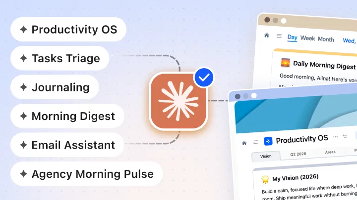
Here is what a real morning digest workflow looks like in practice: every morning before you open your laptop, Claude reviews your Gmail or Outlook for important emails that need attention, pulls any overdue or rescheduled tasks from xTiles, checks Slack for threads where you were mentioned but haven't replied, and optionally summarizes newsletters so they never pile up in your inbox. All of this lands as tiles on today's Planner page — automatically, before you start your day.
Jim said it clearly: "The beauty is you can go to it when you want to instead of reacting to every inbound message. A digest is really succinct."
Instead of opening eight apps to piece together your day, you open one page. The signals you need are already there. The noise has been filtered. That is what a real dashboard does — and it is what xTiles + Claude makes possible without any technical setup.
xTiles has a dedicated Morning Digest workflow you can set up with a single prompt — no configuration required. You connect your calendar, email, and any other tools, copy the prompt, and the digest runs automatically each morning.
On templates: start with one, ignore the rest
Jim mentioned feeling overwhelmed by the template gallery — too many options, no clear starting point. This is a common pattern when people first open xTiles, and the advice is the same every time: pick one template, use it for a week, then decide what to change.
Templates in xTiles are starting points, not commitments. Every template can be duplicated and modified freely. If you duplicate Steve August's weekly dashboard, for example, you get a working structure you can rearrange, rename, or strip down until it matches how you actually think.
The goal is not to find the perfect template. The goal is to have a dashboard you will actually open on Monday morning. Start with "good enough" and adjust as you go.