Aesthetically pleasing and functional design is always based on certain rules. Even if you’re an experimenter who likes to break all elements of archaic conventionality and take people’s image of design up to the next level, you need to learn the rules first to be able to break them.
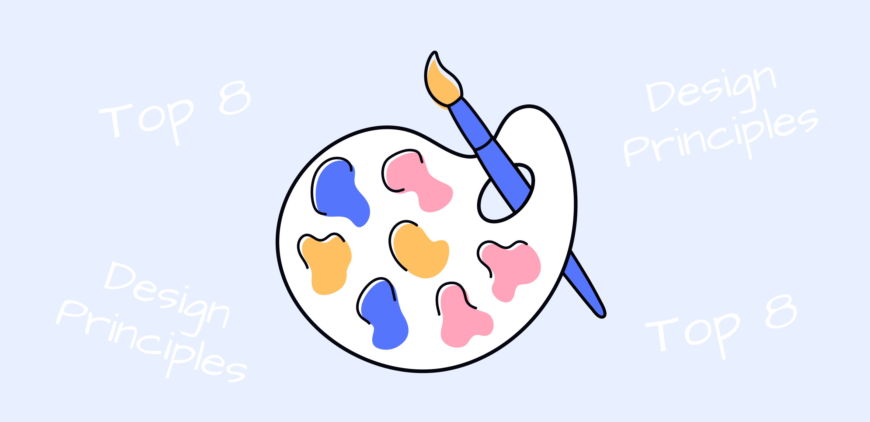
The pillars of design are:
- Balance
- Contrast
- Alignment
- Proximity
- Repetition
- Hierarchy
- Movement
- White space
If you’re a novice designer, all these words might look like something that was created by those without imagination and creativity to restrain your own genius. I was there too. I thought that a few brave elements and wild colors I mixed would change the industry. Well, they didn’t, and they never could. Alas, I didn’t know that because I didn’t pay much attention to the eight main principles of design.
Those principles were created and polished to help you make a design that serves its purpose. They won’t limit your creativity or force you to think “inside” the box. Let’s discuss each of them. I will share my experience on how I learned and automated them using xTiles.
1. Balance
I would like to start with balance because I believe it’s the main principle of everything, not only your designs. Everything on your page has its weight. Even the smallest element, every color, and every texture you use have weight. They must work together, keeping users’ attention where it’s needed. Putting all you have to offer in one part of your page and leaving others with nothing will make your design look at least strange. Sometimes, it might seem that there was some kind of trouble, all the elements migrated, and the author didn’t manage to fix it.
Your initial idea has to be considered depending on the page balance principle. If you want to design a symmetrical page, place your elements evenly on every side of a central line. The main problem people face when creating symmetrical pages is that it’s easy to make them boring and uninteresting for a user. That’s why blindly following rules might lead you to failure.
The rules have to be applied according to your unique style.
The asymmetrical design is based on finding the balance between elements of different weights. You may counterbalance one big element with a couple of smaller ones. Usually, asymmetrical pages are more attractive due to their bravery.
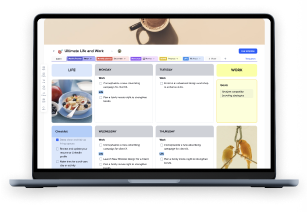
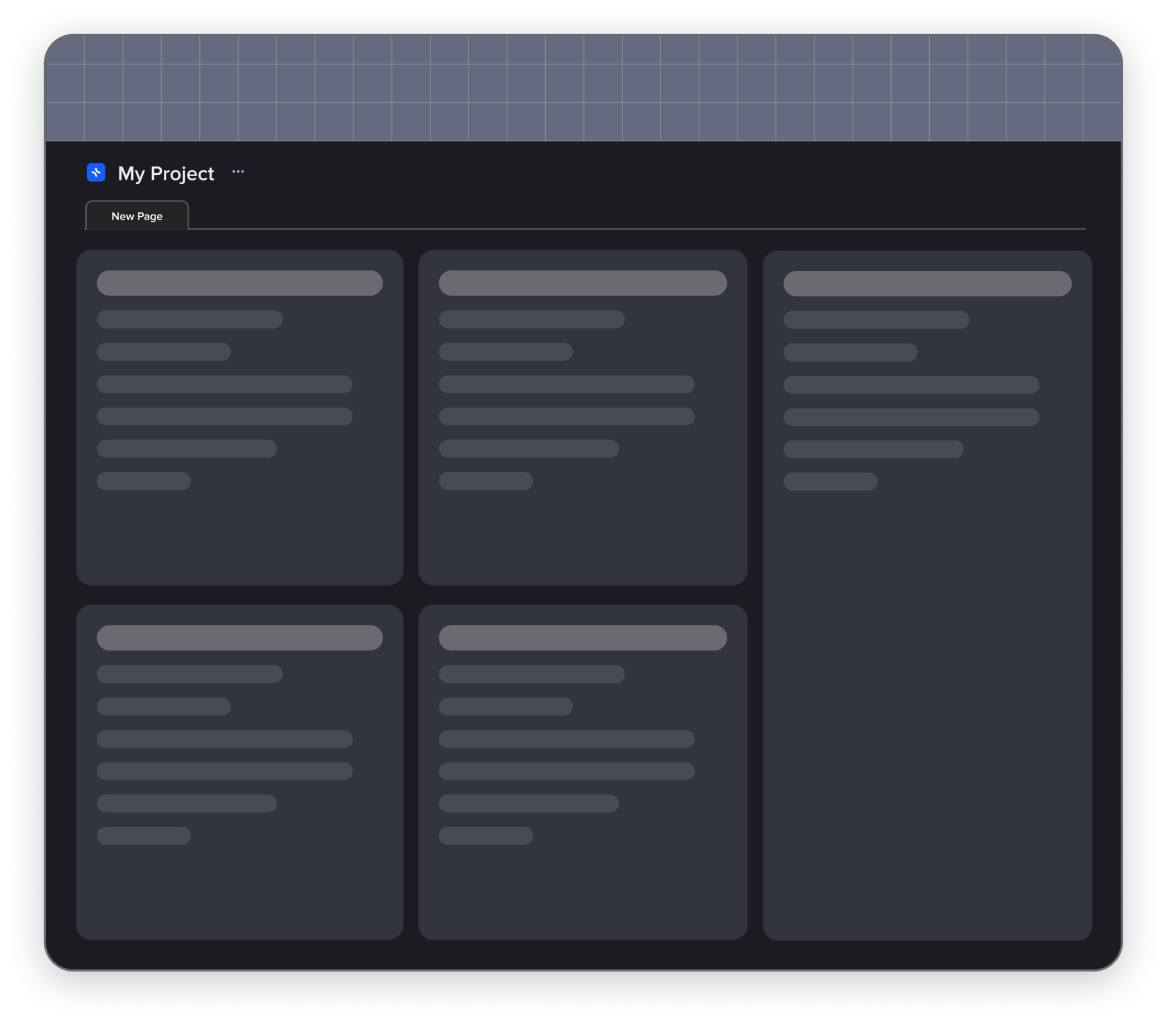
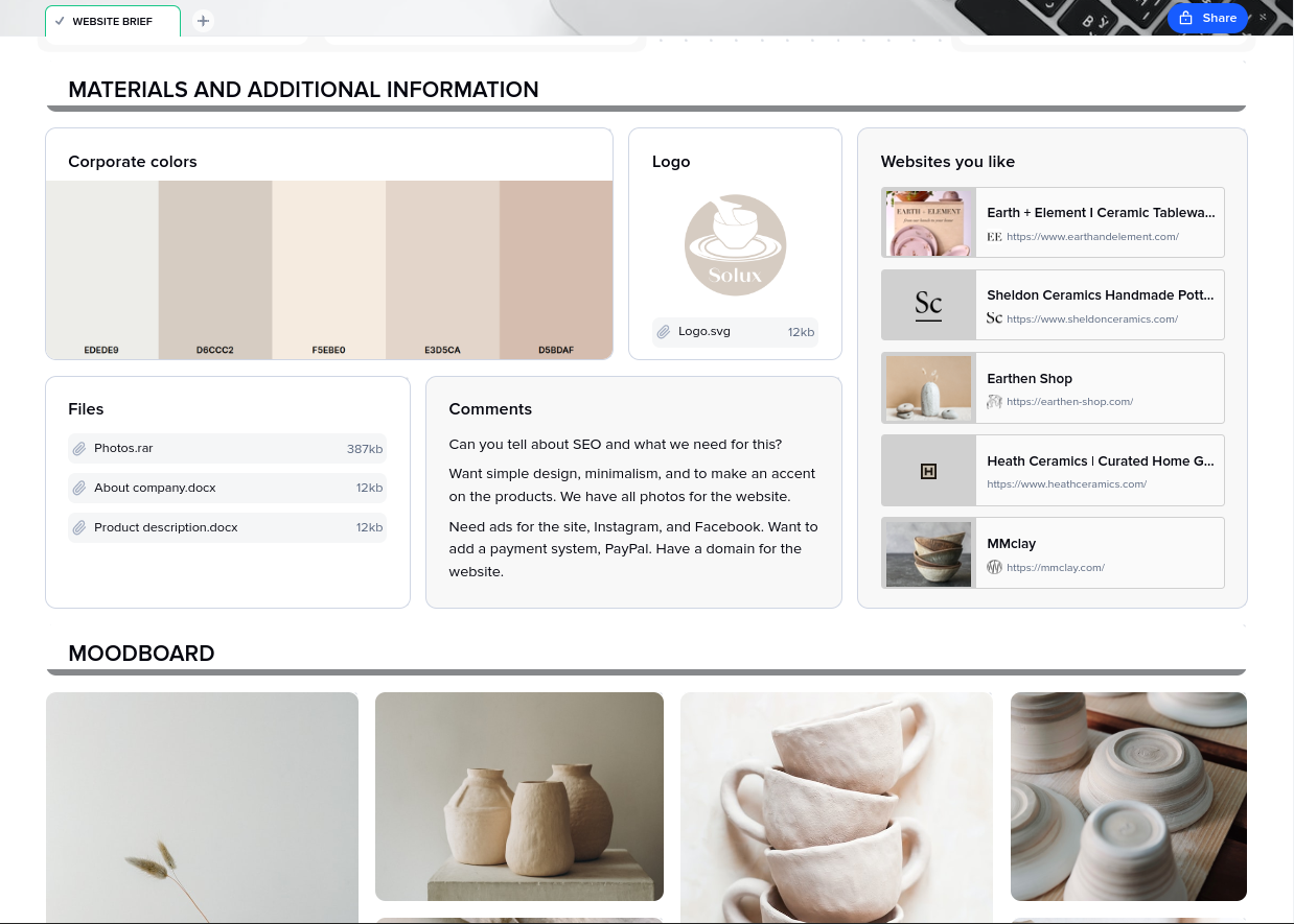
I usually use the xTiles Website Brief to put together everything I need to start designing pages. I work on it with my client or manager to grasp the correct understanding of what design I should deliver in the end. It helps me catch the needed vibe and start creating.
2. Contrast
Contrast is what makes your design recognizable. The right contrast lives beyond the actual page, it stays in people’s minds. The important thing to remember is that contrast is not about wild colors that make your users dream about wearing their sunglasses. It’s mostly about the harmony between all the colors you used on one page. Also, they shouldn’t take all the attention away from the text or rich content you used.
Another important thing is that contrast is also about the text too. It might be very tempting to use bold or italics everywhere, but how will your potential audience understand the most important points?
Another common sin is using all the beautiful fonts there are on one page. OK, maybe I exaggerate, but, as a rule, two fonts are more than enough to create great, easy-to-understand, and perceptible contrast.
I always try to think about contrast and balance like these two are tightly chained. For me, they are yin and yang. Nothing should divide them, although you can.
To find the perfect balance and decide on the boundaries of my design contrast, I usually start all my projects with mood boards. It helps me check what colors, textures, and fonts work together. You may try the xTiles Mood Board Template.
3. Alignment

Every step-by-step guide for beginners will emphasise that order and structure are important for the adequate perception of your design. Well, they won’t be wrong. If a user doesn’t know where to look, they probably will choose not to look at all. For me, the fact that order usually comes from little details became a huge revelation. They are unrecognizable at first glance or without a trained eye because they mainly work on a subconscious level.
Another designer probably will see that there’s strange or chaotic alignment on your page. A common user is likely to miss this unfortunate detail if it doesn’t shout out loud from your page. However, a sense that something is wrong will be there in any case.
People’s eyes love easy-to-grasp things. Conventionally beautiful and symmetric faces are easier to “understand” than unearthly ones. The same can be said about designs. Great proportion and polished structure raise the chances people will stay on a page as long as they need to get all the provided information.
Sometimes when you work on one part or element and see that there’s something that needs to be fixed in another place, you can’t switch to another task without failing the current one. I have forgotten what I need to do later thousands of times. Sometimes it did come to me for a second time. Sometimes someone else saw the problem and helped me. But I have forgotten what I wanted to change many more times than I managed to keep it in mind.
Worries that it might have been game-changers for those designs are still with me. However, today I use the xTiles Quick Notes on my phone. Haven’t been missing a single thought for a couple of months now.
4. Proximity

Another thing that will help make your design easy to understand without ruining its beauty is grouping related elements together. By creating visual coherence, you shorten the time a recipient needs to get the needed information. Making your user scroll relentlessly through the page or putting together a puzzle is never a good idea.
Also, there are some rules that certain buttons or links are supposed to be in a certain place. For example, contact info, FAQ, social media, etc., are usually at the bottom. In some sense, it eases designers’ work. However, it also makes a common user a bit lazy. They might not check the page that offers them something that differs from what they are used to seeing.
5. Repetition
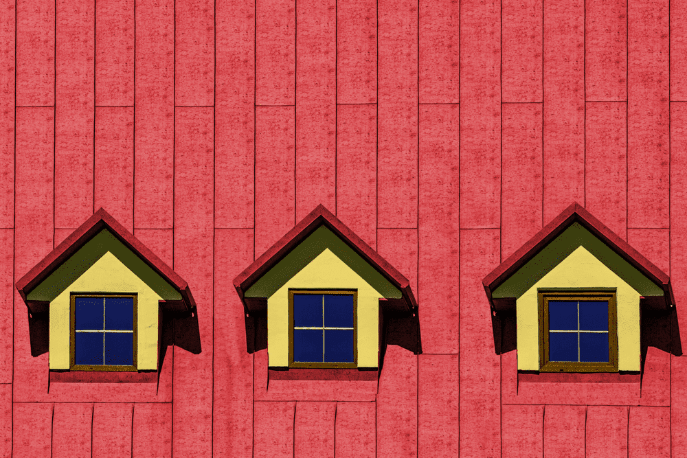
Repetition is inevitable in any case and especially when you are working on a minimalistic design. So, when after some time, you see that there are many similar elements on your page, don’t worry. If everything is done correctly, they won’t spoil the whole page. They will strengthen the design showing its unity.
Be aware that it’s easier to make a mistake when having many similar components on one page. One word of different color and font may raise many questions. However, sometimes it might become an accent that will make your design look witty and interesting.
6. Hierarchy

Many of these principles are tightly connected with each other. Hierarchy won’t work without proximity. Except for grouping the elements, you need to show what is more important and what is less important. You need to show your recipient where to start.
Let’s imagine you work on an advertisement. What should be the main message? The name of the company attracts attention because everyone knows it? Or the name of the project/product?
That’s why you will need to organize the information before starting. I prefer to use the xTiles Creative Brief to structurize everything I know about the project/company/product, etc.
7. Movement

Movement is about your communication with your recipient and about communication within your design. A well-designed composition leads an eye from one point to another organically. It tells a story. This or that company manufactures this or that product, delivers this or that service, etc.
All the previous principles we discussed above will help you create your narration. However, if you diligently applied each of them, the movement might not appear on its own. Everything must be in harmony so the eye will travel from one element to the next smoothly. Nothing will stop it for too long, and nothing will draw attention to itself.
How is that possible? You need to prepare beforehand. Improvisation is an important skill, but if you know what you do, you’re 100 times more likely to achieve the needed result. Sketches and plans described in words will help you.
8. White space
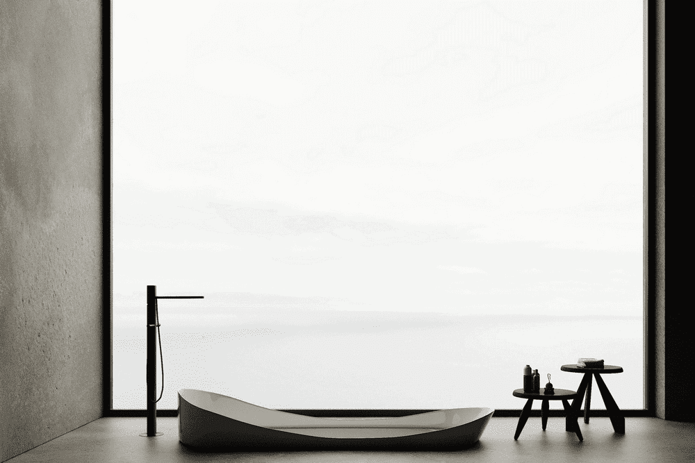
Have you ever heard that design has to breathe? No, you don’t need to put it outside. White space (sometimes called negative space) is what you didn’t add to your design. Nevertheless, its role is tremendously important. For beginners, it might be scary. Many decide to fill it with everything they have.
If you think that white space is where you can save yourself time because you have to do nothing, you’re a bit wrong. White space and how much there will be of it shape your design’s hierarchy and organization.
Sometimes, one square inch of negative space turns a mediocre design into something astonishing. So, if you look at the result and feel that something is still missing, maybe its white space is missing?
Summing Up

There are much more rules and principles in design than these eight. Probably more than you could count on the fingers of ten hands. In some sense, they are inevitable because, unlike art, design has a strict purpose. But I don’t like to