Note-taking tools evolve faster than ever, presenting features users 10 years ago couldn’t even dream about. They have become more than just a space for your notes. They help you handle big projects, develop ideas, build and organize routines, work with your team, etc.
Today, users can choose between numerous apps to which to trust their notes, but Evernote stands out due to its long-term presence on the market and features like jotting everything down quickly and efficiently. However, as with any other tool, Evernote has some drawbacks associated with these notes’ further use and visual organization. Lately, the app has presented a list of changes that raise even more questions, making people reconsider their initial choice.
Evernote – the classic note-taking tool
.webp)
Evernote is a well-proven tool for note-taking and, a bit less, for task organizing and tracking. Evernote was created in 2008 and became a huge revelation for everyone trying to enhance their productivity back then and for the next few years. However, as years passed and new tools emerged, Evernote didn’t evolve much to respond to new challenges people faced and match innovations.
The application has recently changed its approach and philosophy significantly due to new owners. That’s why many devoted users say that it’s a new application, and many new users are still abashed by its previous reputation.
Bending Spoons, the company that bought Evernote, has spent the last few years incorporating numerous changes. The full cycle, like fixing high CPU usage issues and frequent freeze-ups, might take a long time, but users already have a new interface designed (the old one was bettered), the ability to create events and new pricing.
The features that make Evernote stand out:
- Web Clipper: Users may save online material straight to their Evernote account.
- Text search in documents and PDFs: Allows users to look for text in a variety of file formats.
- Document scanning: Enables tangible documents to be digitalized.
- Audio notes: Users may record and keep audio notes with this feature.
- AI: Evernote offers the elements of artificial intelligence to make its work more effective.
- Sketching: Users can draw and sketch concepts like they would do it on paper.
Evernote is a well-known player in the digital planning market. It seems like it was there forever. However, Evernote has drawbacks that can affect one’s productivity. While it remained still, the market evolved, and now users have plenty of vibrant and flexible apps to choose from, like xTiles.
xTiles is a new product for note-taking and productivity, especially in comparison with Evernote. However, today xTiles has already presented many more features and built-in tools for note-taking, idea capturing and storing, creative document organization, task management, project management, etc., than Evernote. Let’s take a closer look at what distinguishes xTiles from Evernote.
Design/Interface
.webp)
Evernote has been known for its stability, meaning there have been a few innovations over the years, especially regarding its interface. In January 2024, the Evernote team presented a new interface that is based on the old one, with slight changes to enhance and smooth user experience.
The application offers a plain and easy interface that doesn’t overwhelm users with unnecessary details and elements, yet it might not be as dynamic as other note-taking apps. However, a stiff interface also means that it delivers information in a business-like manner, kind of like Excel sheets.
While xTiles offers a canvas that is visible and accessible for work and changes through your screen, Evernote visualizes the path the user has made. Every previous step is visible on the screen, too, which steals space for work and limits the view. For example, if you want to open one of your Notebooks, you will also have your menu at hand (which can be partially hidden to save a bit of space) and the Notebook’s other content. To immerse fully and start working on the subject, a user will need to waste their time arranging how their work screen works.
We all know that perfection hides in simplicity, but that might not be the case if you’re a visual thinker. The Evernote interface is highly functional for text-based notes with some visual elements but is more utilitarian compared to apps focused on a visual organization like xTiles.
An important part of every tool design is how much a user can change it according to their preferences. In Evernote, customization is very limited. xTiles allows the creation of a composition of tiles on a page through a drag-and-drop interface that speaks to users. A tile is a basic unit for organizing and storing data of different types.
If you’re a visual thinker who only needs a basic space for images and notes, Evernote could work well. However, for a more robust visual organization, you might consider tools like xTiles.
Pages
.webp)
The Evernote page is a polished version of a Google Docs page that focuses mainly on textual content, with rich content as an addition. The vertical page offers different customization options for text, which end once a user needs to insert images. This turns a document into a long, unorganized charter, where finding something without the Search function becomes a challenge.
The xTiles page also has a vertical structure, but it consists of tiles that can be arranged/rearranged into a creative composition. The Document page type is only one of the possible options in xTiles. Each tile can contain different kinds of information. By dividing a page into tiles (blocks that resemble sticky notes), xTiles ensures that a user can easily evaluate and distinguish data in their workspaces.
This block structure for better visual perception is only partially presented on the Evernote Home page.
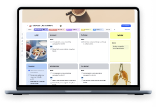
Additionally, xTiles offers a new type of page – a creative page. This whiteboard canvas and vertical paper combo is perfect for your text, photos, files, tasks, embeds, and other types of blocks. It makes creating visual layouts for planning, brainstorming, and research much easier. Working on a creative page feels a lot like working on a webpage in a website builder but with way less work and a much simpler interface.
Compared to Evernote documents, creative pages give users way more flexibility and look more varied and appealing because of the multiple layout options and advanced styling capabilities.
Note-taking
.webp)
Evernote is a great choice for those who have grown up on the traditional approach to note-taking, where you had a notebook, and your notes’ organization and look depended solely on your own creativity. If a user has no intention other than to take notes and needs only a few basic features, Evernote is a great option.
If we don’t consider notes to be only the first point, not where things end, an app has to offer more than a blank space to insert them, especially if it aims to be more than a digital alternative to paper. Otherwise, notes risk staying only words with little or no potential to be implemented. Unfortunately, Evernote takes notes like a starting point, with no logical continuation for them, so users have to look for more tools to do the output work.
Having several tools to go through your daily routine might be quite overwhelming, given the fact that you will need to pay for all these tools, spend time learning how they operate, and regularly spend time transferring the data from one app to another. If you don’t want to add one more app for writing, one more app for task management, etc., to your desktop, then you need something more versatile and flexible like xTiles.
One of the powerful advantages of Evernote note-taking is the ability to scan handwritten notes via the Evernote mobile app. Users will get their notes captured and can even use the search feature to find the needed piece of information. However, users can convert these notes into typed text on their manually or by using additional tools.
xTiles provides familiar document-type pages for short and longer, more structured content, similar to other note-taking applications. However, xTiles goes beyond this conventional approach by introducing creative pages, a unique feature that sets it apart from its competitors.
These creative pages allow users to employ tiles, enabling the creation of entire boards of notes. This approach offers a more visual and flexible way of organizing information. Users can easily structure and reorganize their notes within pages or documents using an intuitive drag-and-drop interface, providing a level of flexibility that surpasses traditional document formats.
Both xTiles and Evernote offer convenient Quick Notes features, but each with a unique approach. xTiles Quick Notes panel acts as the place to jot something down rapidly, as well as a repository for frequently accessed notes and a content capture feed, extending across both desktop and mobile platforms. Users can share text, links, photos, and audio effortlessly. In contrast, Evernote Quick Notes focuses on speed, letting users jot down ideas instantly, with minimal setup. It’s accessible via shortcuts and syncs across devices.
Additionally, Evernote’s Basic plan offers only 60MB of uploads per month, whereas xTiles Starter plan offers unlimited storage, which will be sufficient not only for text-based notes but for images and other multimedia, too.
Task management
.webp)
Reminders, Checklists, and Tasks are the three levels of task organization that Evernote offers. Even though each level can handle different job complexity and context, Evernote lacks the flexibility to become a complete solution for personal and professional productivity. The app’s task feature is more for turning basic notes into actions and has a long way to become/integrate a fully workable and distinguishable task management system.
xTiles has a full task management system built in. It’s a combination of traditional task management tools and deep integration into the platform as a whole.
Evernote’s checklist tool is good for more regular or recurring tasks, like inventory checks and shopping lists. This feature has been updated lately to allow users to mark completed tasks, which makes progress tracking more visual.
In Evernote, users can create multiple tasks per note, set reminders, assign tasks to others without allowing them to see the entire note, mark critical tasks, and organize them as needed. A separate “Task View” window provides a focused view of all tasks. However, if you choose to hide your menu because you work from a smaller screen or need all of your screen, you will need to do two more steps – open and hide the menu while in xTiles task setting feature is available without any additional moves, just like the menu to check all of your tasks. Also, xTiles allows you to distinguish between your personal tasks and the tasks assigned to you by other users, making it suitable for both personal and professional productivity.
One of the big features of xTiles is the ability to create tasks directly on creative pages or documents. You can blend tasks, notes and various resources on one page and have a full view of a project. Task creation within the content creation process is a big productivity and contextual Organisation booster.
xTiles also has a unified task collection through a task sidebar. This collects all your personal tasks from across different pages and groups them by day. You can create tasks in this panel and it’s a central task management system for all your tasks. This panel is also available in the mobile app and it’s similar to a classic task management app, so it’s intuitive and familiar to most users.
xTiles has task collections for each project. This is super useful for team collaboration, it’s a control panel for project managers. It gathers tasks from all project pages assigned to different team members and you can centrally manage statuses and priorities. It has built in properties like Due Date and Assign, but you can also add custom properties for your project specific needs.
Some of Evernote’s more advanced task management features are only available in the business editions. For users who use the free version and rely heavily on task management this might be a drawback.
Evernote Notebooks VS xTiles Workspaces
.webp)
The ability to organize documents in a easily accessible way is a must for quicker work and productivity. Constant search among everthing you have create might be time-consuming and irritating. Both Evernote and xTiles present this feature yet in very different ways.
In xTiles Workspace, every project is a unique element where you can visually identify the content you need to open. Evernote Notebooks resemble a traditional folder structure with names only, which might become overwhelming over time.
xTiles Workspaces preserve all the features a user may need, regardless of their current task. Users still have access to their calendar, quick notes, reminders, tasks, etc. The system is integrated, allowing for easier switching between tasks without additional steps or interrupting the process. Owners of many workspaces can reduce the time needed to find something by using the Recent category.
xTiles Workspaces are also conveniently divided into personal and team workspaces, so this organizational step is already handled. Users can switch between needed workspaces from a menu block on the main page.
Databases
.webp)
Notes that accumulate over time often need to be consolidated into something bigger, like a database, so that users don’t have to deal with scattered pieces of information. While Evernote doesn’t provide a built-in feature for organizing large amounts of diverse information, xTiles offers Collections – a special kind of databases. These pages offer a dynamic and user-friendly approach to information management, allowing for creative work and organized storage to coexist seamlessly within the same system.
Templates
.webp)
Templates enhance user experience by shortening the time one needs to create a document from scratch, especially if one needs to create something they have never done before. Evernote offers a variety of ready-to-use templates for different purposes, such as planning, taking notes, journaling, etc. However, their look and functionality resemble tables in Google Sheets, and their customization options are limited by the overall customization of Evernote.
xTiles offers well-developed templates for team and personal use that respond to different requests. Also, xTiles users can benefit from using highly-specialized templates, like templates for people with ADHD.
When users add templates from the Evernote Templates gallery, they get them into one of their Notebooks, meaning there’s no united workspace with quick access to every document or project they have. In xTiles, templates are conveniently added to a workspace, the starting point of every process.
Collaboration

Evernote for personal use and Evernote Teams (a paid plan presented to allow big teams to work collaboratively on the same projects) have different levels of collaboration. In the first case, you’re limited to sharing your notes with others. Even users with Professional plans can share only separate notes. In the second case, you get a shared workspace where every team member can participate.
The drawback wouldn’t be that significant if it weren’t for a price. A yearly subscription for one Evernote Teams user will cost $2790, which makes Evernote suitable only for big companies that can spend this amount of money to provide their employees with collaborative project management tools. Small companies and start-ups are left behind.
In xTiles, collaboration starts with a free plan. A user can share their workspace with their teammates to work together on the same tasks, adding notes, all types of content, leaving comments and reactions, etc.
Unlike xTiles, Evernote Teams offers a centralized account with administrative rules to manage the shared workspace. This feature may help big companies monitor their collaboration, manage accounts, and keep everyone on track.
Mobile app
.webp)
The Evernote mobile app lacks the functionality of the desktop version. Many users are frustrated because the text is too small for easy interaction, and there’s no way it can be enlarged, which is especially troublesome for smaller screens.
Evernote mobile application drawbacks become even more visible through different applications, like Drafts, which were developed to enhance user experience. This one in question helps people to take their notes quicker and sends them to Evernote.
In the Evernote mobile version, users are allowed to customize how their Home page looks to enhance their experience and delete/add parts of the Home page design they need to have at hand.
The xTiles mobile app offers a comprehensive and user-friendly approach to productivity on the go, distinguishing itself from competitors with its multifaceted functionality. While it has access to projects that replicate the web interface, this is not its main purpose. It also has a great task management system. The interface for this function is reminiscent of classic task management apps, offering an experience comparable to popular tools like Todoist. So users can manage and complete work from their mobile devices.
Secondly, it has a streamlined note-creation experience. It balances simplicity and power, so users can jot down ideas or create more detailed notes as needed.
Lastly, xTiles excels in information capturing. Users can send text, links, and images from other apps like web browsers into xTiles. The app also can create notes using the device’s camera or record audio notes, so it’s a capture tool.
All these features make xTiles mobile app a complete productivity companion, task management, note-taking, and information-capturing all-in-one tool.
Pricing

In Evernote, the free plan changed dramatically in 2024. Now, it offers less than it used to, which, for many, has become a huge inconvenience. For example, now it offers only 50 notes and one notebook in a free version, which is quite a small amount for a note-taking app, forcing people to look for alternatives where they can keep their basic planning for free. Additionally, users get default note examples when they register, which they will need to delete to free up space. In xTiles Free versions, users aren’t limited by blocks or projects they create.
Those, who after years and years collected hundreds and hundreds of notes, might feel betrayed because they have to pay to be able to use their notes.
Also, free users can’t sync devices, which might be enough if you plan to use Evernote from your phone or laptop solely. However, if you want to be able to access your notes from two devices, you will have to choose which one to switch off. In xTiles, users don’t face such limitations.
xTiles offers more budget prices for both personal and team use, special offers for students and educators, and the ability to earn money selling templates via xTiles Template marketplace.
xTiles VS Evernote: verdict
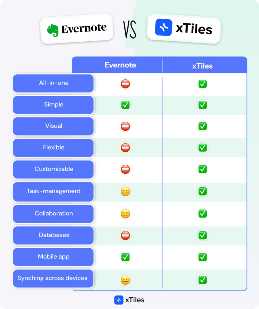
Evernote and xTiles offer different approaches to note-taking, task management, and project organization. Evernote’s years of inaction and recent changes and limitation have opened the door for more innovative solutions like xTiles.
xTiles is more versatile and user-friendly, especially for those who value visual organization, flexibility, and seamless integration across all productivity needs. Its creative pages, intuitive task managementб, and robust collaboration features offer a more complete solution for individual users and teams. The platform is adaptable to different work styles, and more affordable pricing makes it a great alternative to Evernote for small businesses and startups.
Evernote may have updated lately, and it seems like new changes will come shortly, but still, it couldn’t be far from being an app for simple note-taking that falls short in visual customization, advanced task management, and affordable team collaboration features.
In the end, it always comes down to individual needs and preferences. If you want a traditional text-focused note-taking tool with a familiar interface, Evernote may be enough. But if you want a more dynamic, visually oriented, and integrated productivity platform that can grow with you, xTiles is an option.

FAQ
How does xTiles differ from Evernote in terms of visual organization?
xTiles has a more flexible and visual interface, where users can create compositions of tiles on a page through drag and drop. It also has creative pages that combine whiteboard canvas and vertical paper, so you can create visual layouts for planning, brainstorming, and research.
What are the main differences in task management between xTiles and Evernote?
xTiles has more comprehensive task management built-in, you can create tasks directly on creative pages or documents and have a unified task list in the sidebar. Evernote has basic task management with 3 levels of organization (Reminders, Checklists, and Tasks) but lacks the flexibility and integration that xTiles has.
How do xTiles Collections compare to Evernote Notebooks?
xTiles Collections are special databases that are used for different data visualization needs. You can add blocks or tiles from documents or creative pages directly into collections, so you have more flexibility to organize complex information. Evernote Notebooks are more limited, mainly text-based content organization.
What are the main differences in collaboration features between xTiles and Evernote?
xTiles has collaboration features even in the free plan, you can share workspaces and work together on tasks and content. Evernote collaboration is limited in personal plans, full team collaboration is only available in the expensive Evernote Teams plan which is $2790 per user per year.
How do the mobile apps of xTiles and Evernote compare?
xTiles mobile app has a more comprehensive approach, robust task management, streamlined note creation, and effective information capturing. The Evernote mobile app is more limited in functionality compared to the desktop version, users are reporting small text sizes and the need for third-party apps to enhance its capabilities.
